When Morton Williams, a trusted New York City grocer with over 50 years of history, was acquired by Wakefern, the team partnered with us to reimagine its identity and deliver a more cohesive, resonant store experience.
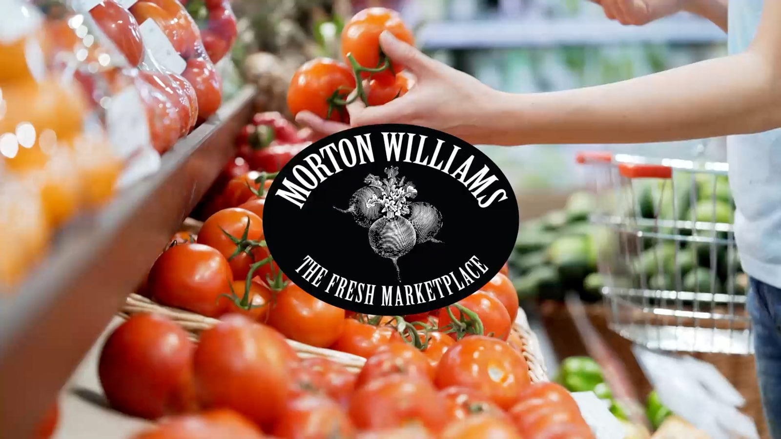
Morton Williams: A Fresh Brand for The Fresh Marketplace
Our Role
Strategy
Branding
Advertising


We began with deep research and discovery—studying what makes Morton Williams distinct and what keeps New Yorkers coming back. From these insights, we uncovered a defining truth: Morton Williams elevates the everyday, bringing care and craft to even the most routine shopping moments.


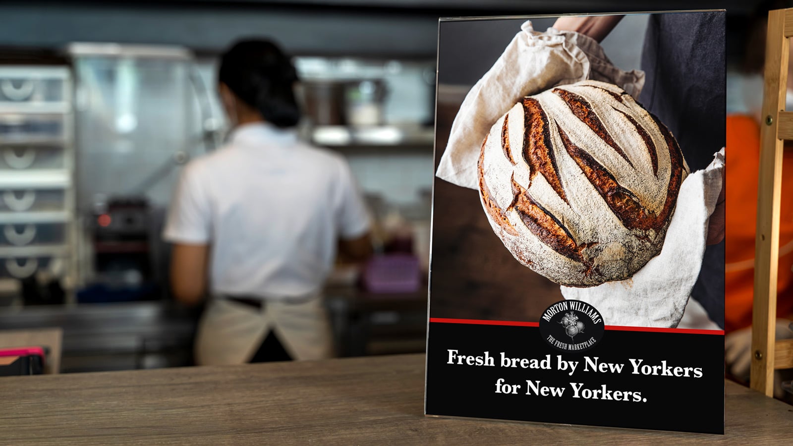
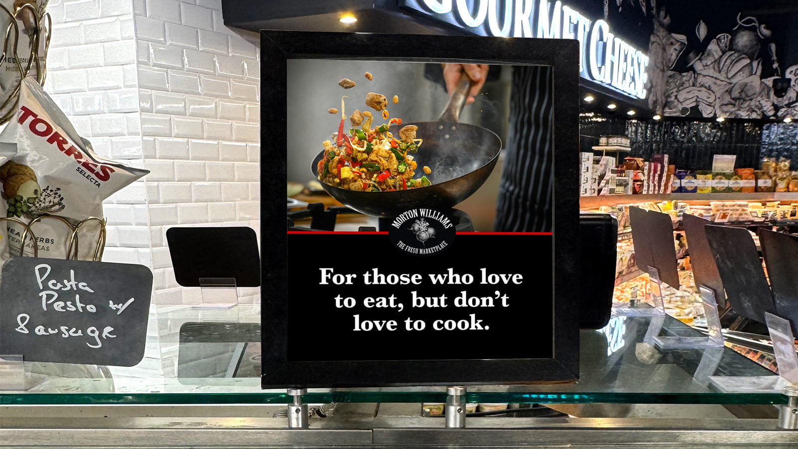
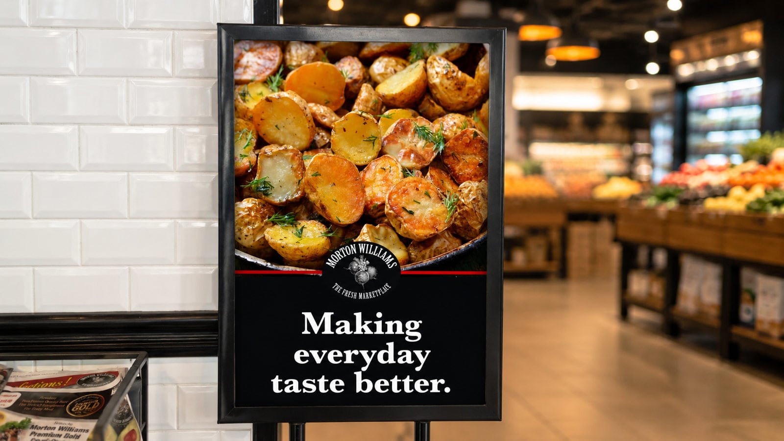
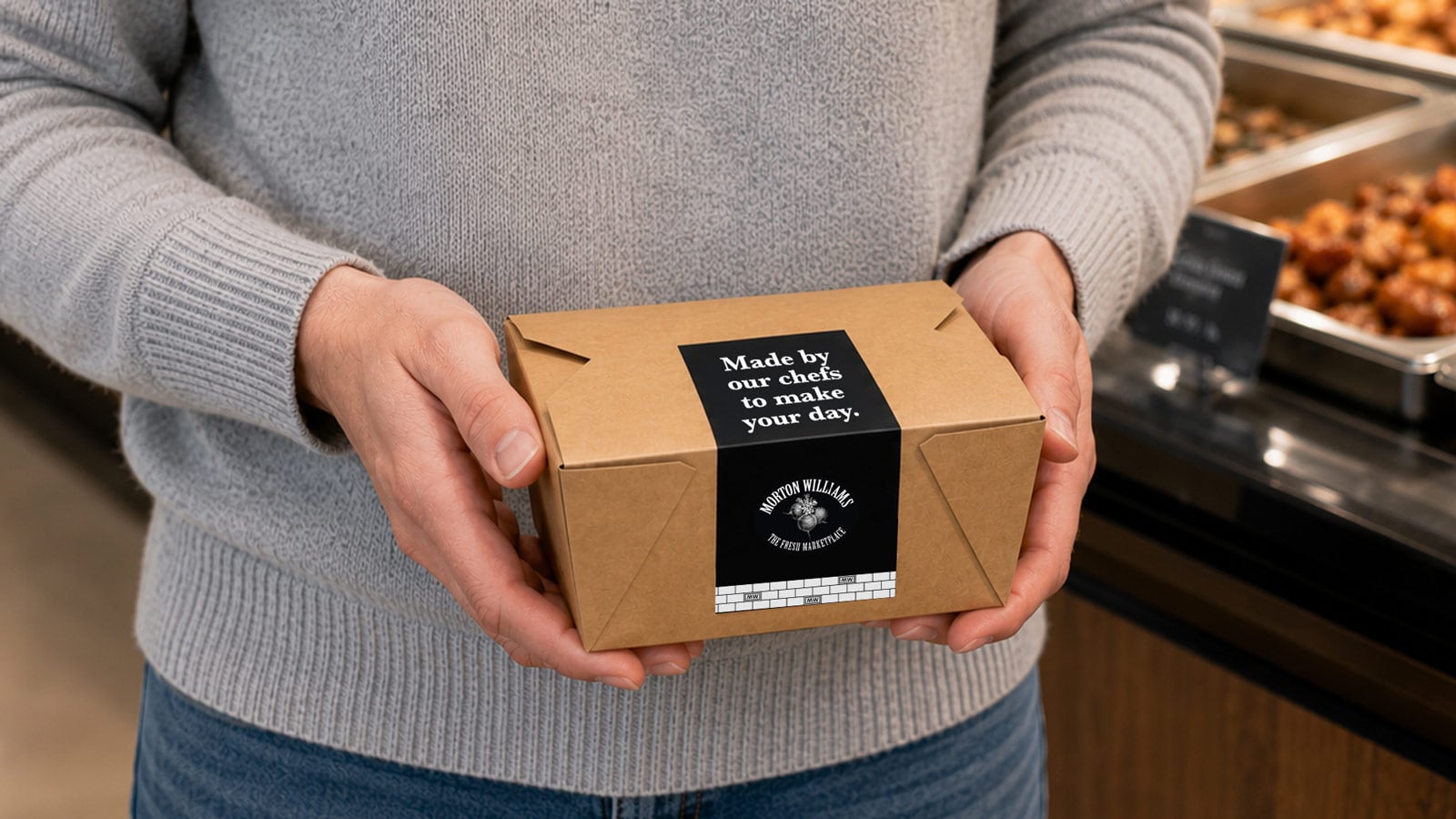
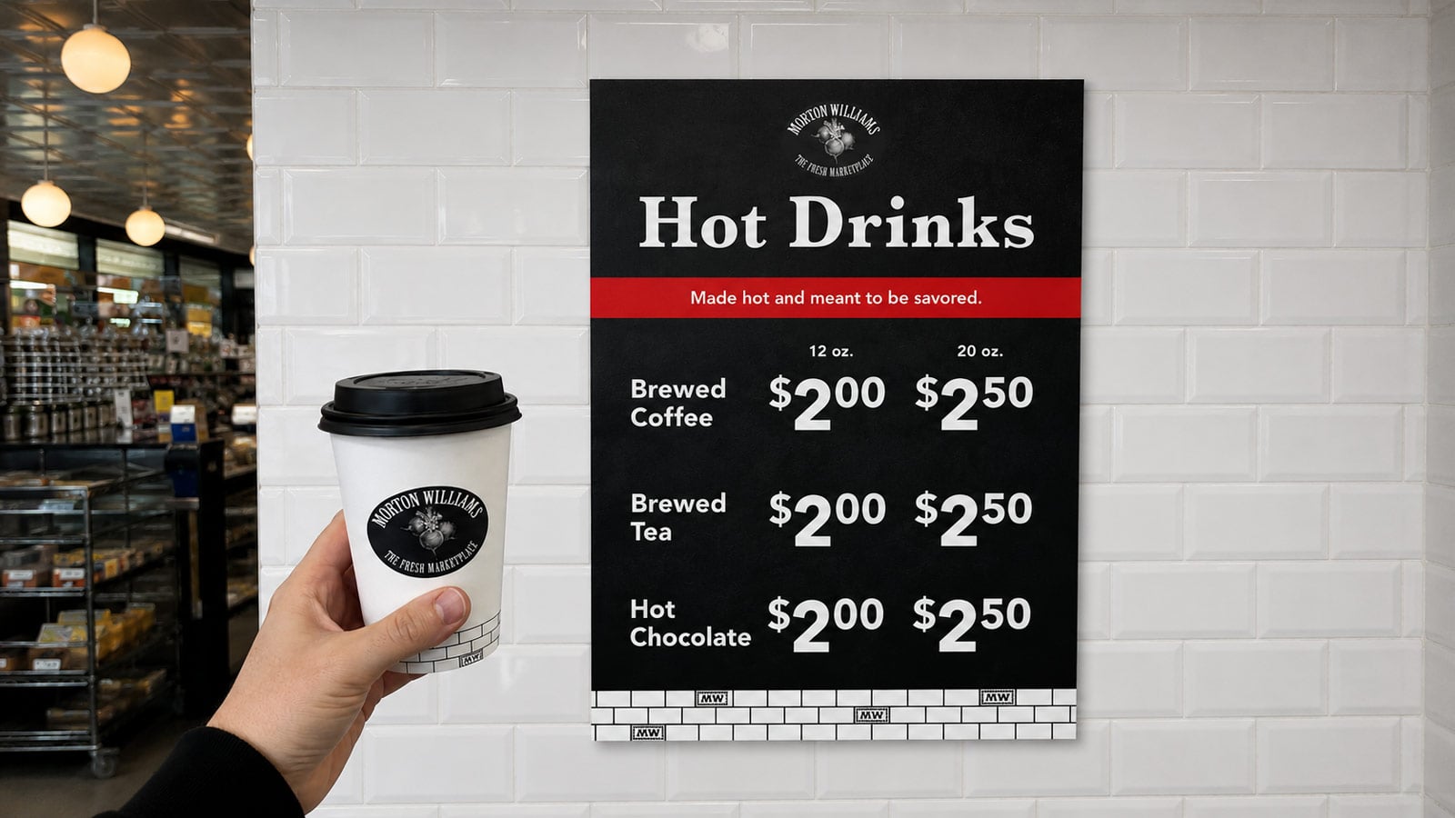
Across chef-inspired prepared meals, curated gourmet offerings, everyday essentials, and fresh produce, the refreshed visual identity unifies the experience through a disciplined design system—combining classic typography, a high-contrast black-and-white palette with signature red accents, and New York–inspired graphic elements to create a cohesive, distinctly local expression.


We developed a full suite of in-store touchpoints guided by a clear communications hierarchy—announcing, amplifying, and explaining—to help customers navigate intuitively while discovering more along the way. Signage moved beyond function to tell a story, highlighting seasonality, freshness, and craftsmanship with clarity and consistency across every location.

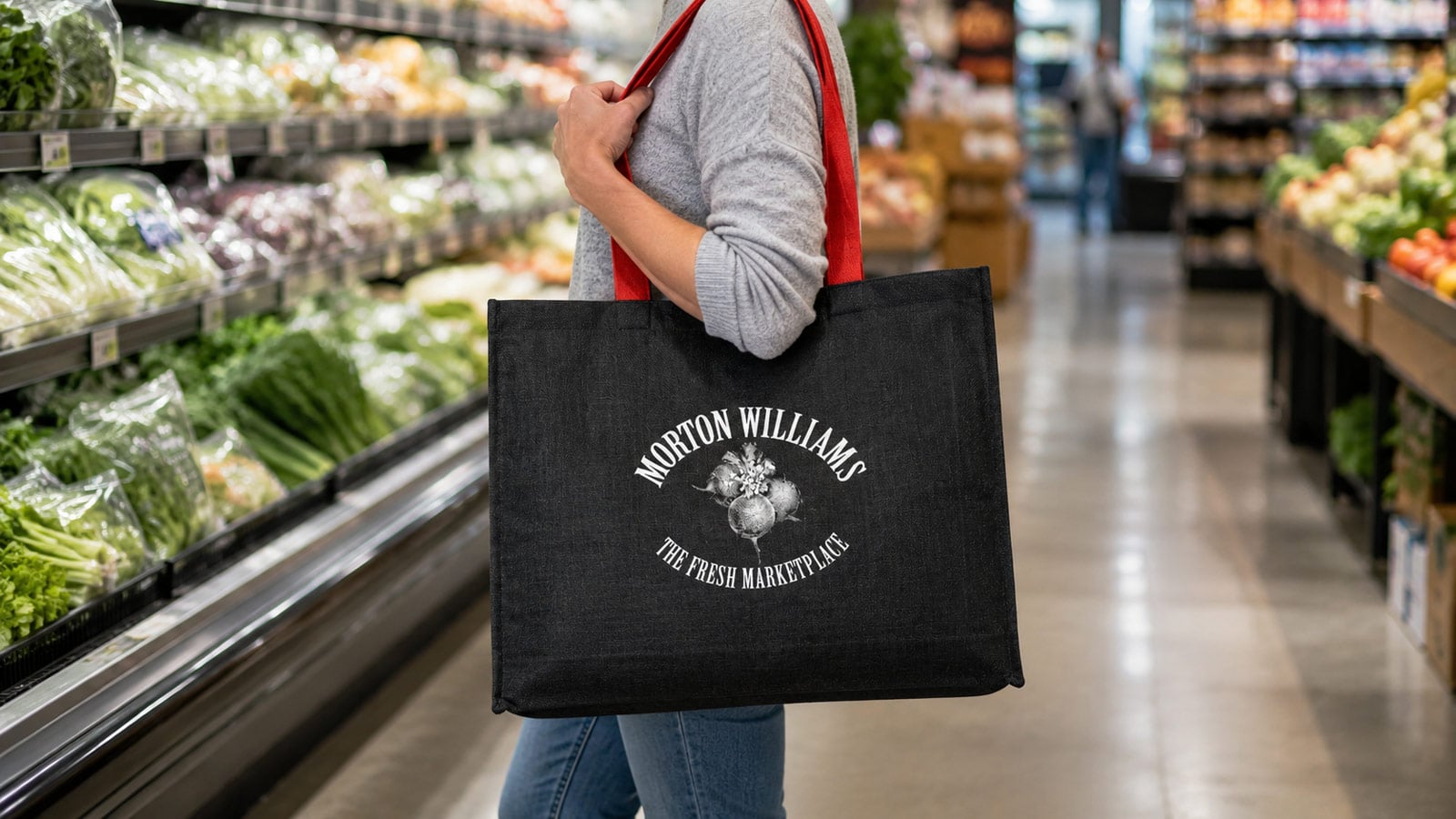
By translating Morton Williams’ authentic strengths into a clear, modern brand system, we helped bring renewed focus to the experience—deepening connections with loyal New Yorkers while welcoming a new generation through the door.
Say Hello
Need a big idea for your business? Have a question about working with us? We’re always up for a fresh, new challenge. Drop us a line to get the conversation started.